A whole new experience

A new website for Haifa municipal

My Role

Product strategy · UX Research · UX Design · Prototyping 

Project type

A website for the city of Haifa

Tools

Figma

Client

The Ministry of Haifa

OVERVIEW

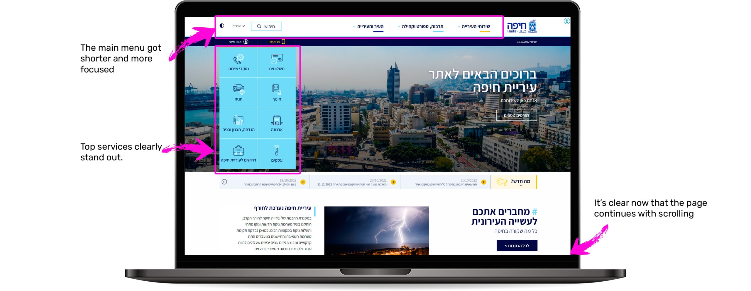
City of Haifa had an old-fashioned website built with outdated technology. The user experience was cumbersome and frustrating. We built a new website from scratch with streamlined user experience and state of the art technology.

THE CHALLENGES

Duplicate content

Departments within city hall developed alternative standalone websites which created information duplication and confusion.

Unfriendly CMS

Unfriendly content management system resulted in infrequent website updates and outdated content.

Unresponsive site

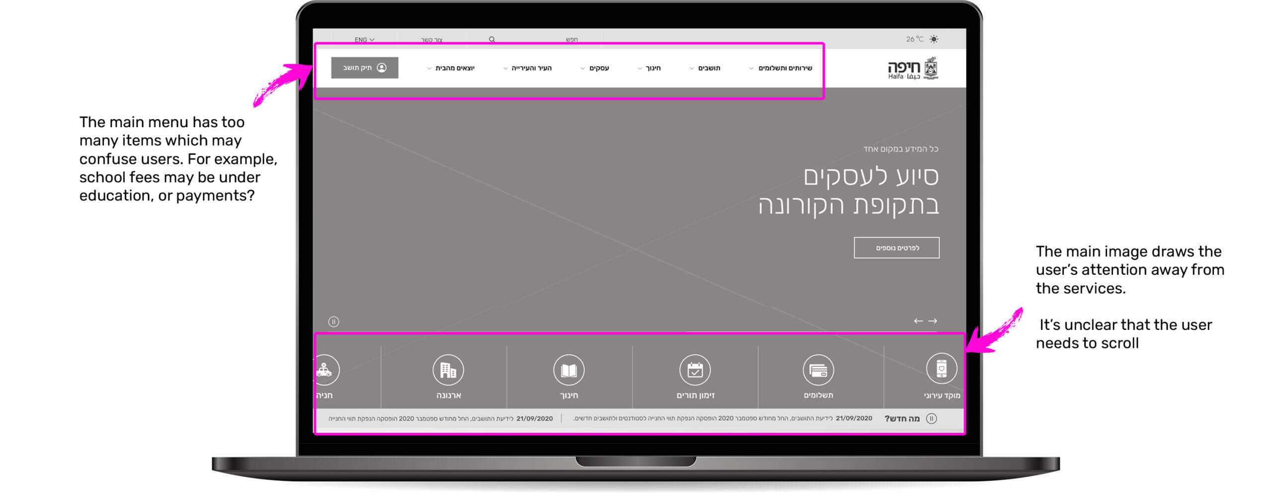
Old-fashioned look-and-feel and not adaptable to user’s screen size (unresponsive).

Wrong site structure

Site was built based on the city's hall organizational chart and did not reflect residents’ needs.

Flawed information search

Great difficulty in finding information, search does not show relevant results, information architecture was not user-oriented.

DATA ANALYSIS

0 %
Engagement rate
0 %
Bounce Rate
0
NEW USERS
0
USERS

Old site

0 %
Engagement rate
0 %
Bounce Rate
0
NEW USERS
0
USERS

New site

Contact Us

3

City tax (‘arnona’)

2

Payments

1

Most viewed pages

COMPARATIVE REVIEW

City of Tel-Aviv

The website is segmented based on 3 main types of target audiences: residents, businesses, and events’ attendees. Each segment shows the most popular actions or services as well as magazine-like content or news that fit the target audience.

City of Tel-Aviv

City of Jerusalem

The homepage presents 5 primary topics, a primary navigation menu that includes 6 options and a search bar. The service (“I want to…”) and chat buttons are placed prominently. The service button gives quick access to frequent actions (e.g, payments), or popular content. Every content page contains clear navigation buttons. The desktop site also shows a side menu with sub-topics.

City of Jerusalem

City of Rishon lezion

Homepage presents 5 primary sections and a clean and minimalist navigation menu.
The services section has a good layout. The service button (“How can I help?”) leads to a basic automated service.
The content pages do not have a good and clear layout.

City of Rishon lezion

INSIGHTS

All information should be concentrated and clearly laid out in one place. Search should present relevant results.

2

All services should be accessible at the homepage.

1

Content management should be easy and intuitive with a minimum learning curve.

4

The website should advertise city hall’s initiatives that benefit residents (such as events).

3

KPIS

Increasing the transparency of the city’s administrations.

Positioning Haifa as an innovative and digital-first city.

Increase in the percent of residents that pay city taxes.

Increase visibility of city hall’s messages to residents

Increase number of service actions (payments, registrations)

Reduce storage and maintenance costs

PERSONAS

Rony visits the city’s website mostly when she needs to pay the city tax or a parking ticket.

Pain point:

Wastes time searching for the relevant page, needs to go through outdated information to find the link to the payments system.

Motivation:

Reducing the time spent on the site and making payments quickly.

Rony Avitzur

41 | Architect | Married + 3

Maor is starting a new catering business. To access information regarding a business permit, he is redirected to another site with partial information. It is unclear to him if this site is operated by the city.

Pain point:

Confusion as he redirected to another site, getting partial and outdated information

Motivation:

Getting all the needed information clearly in one place.

Maor Nismboim

32 | Entrepreneur and a restaurant owner | Married + 1

Shiran works in the city’s spokesperson department. She manages the content of the city’s website. Shiran is technology-oriented, however she has a hard time with the site’s CMS. She is frustrated by the system’s frequent malfunctions and she is reluctant to work with it.

Pain point:

Difficulty in working with the CMS due to bugs, unfriendly user experience, and general sluggishness

Motivation:

Quickly entering new content to the site.

Shiran Sahar

42 | City employee | Married + 2

FINAL CONCLUSION

Developing a brand new city website that is smart, updated that has a great user experience which unifies all of the city’s websites

THE SOLUTION

The project had two main phases:

2

The Core – future project

  1. Revamping the operational systems with the site’s new look-and-feel and user experience.
  2. Upgrades will be prioritized based on the system’s usage, while emphasizing cost saving for the city.

1

The Envelope

  1. Redesign of the homepage and content pages.
  2. Refreshing of the site’s look-and-feel and user experience.
  3. Upgrade of the CMS and training knowledge managers in various branches.

INFORMATION ARCHITECTURE

EXPLORING UX CONCEPT

FINAL RESULT